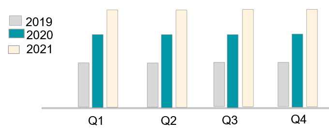
Is there a way to automatically create a series for each year contained in the data behind the table and only have Q1 - Q4 as the data points on the X-Axis?
The primary data structure is like: Date, Quarter (Date), Income in €.
I assume that I can add new columns labeled as the year I want to use in the series and then let Grist build the chart, but this doesn’t feel right.
Hey @alexmojaki, below you’ll find my current status.
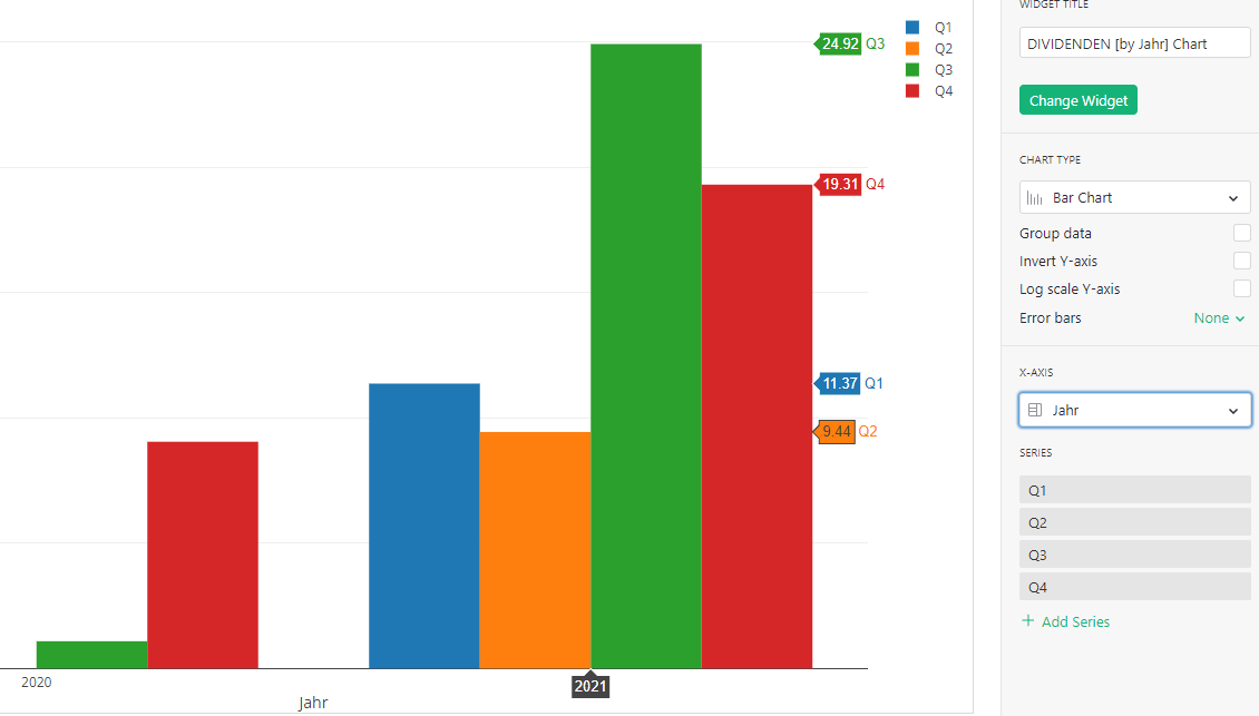
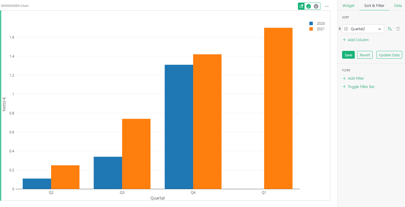
I’ve added a quarter column to my data behind and changed my chart as shown in the image.
However, it appears that the displayed values are not correct. For Q3, I would expect the values displayed in the table below: 2020 Q3: €1.09, 2021 Q3: €24.92.
I am confused and would kindly ask you to take a look into my minimum example.
Here’s the Link to it, you’ll find the corresponding chart on the Interests_Quarter page.
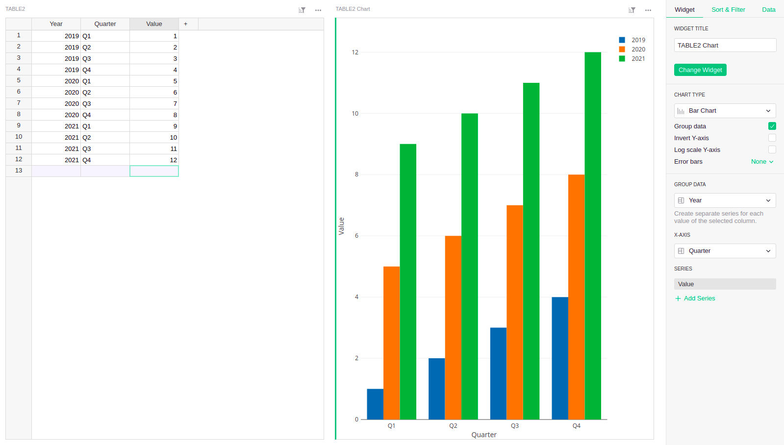
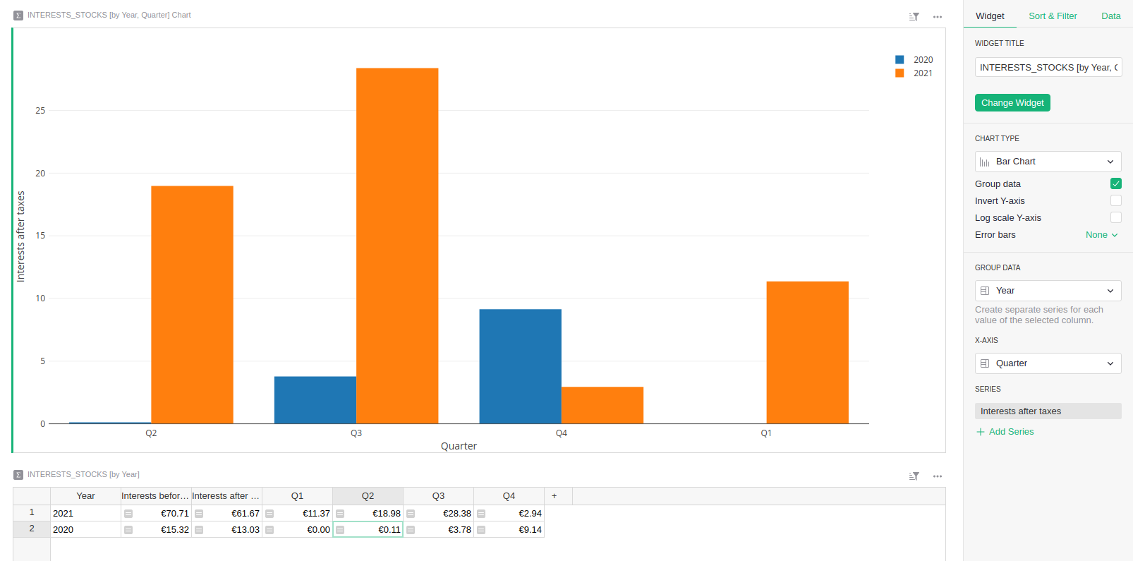
The table underlying your chart has multiple rows with the same Year and Quarter. The chart simply plots the first value of each combination, it doesn’t add them up for you because there’s no way to know if that’s what you want. Your chart should be based on a summary table grouped by Year and Quarter, that will add up the values.
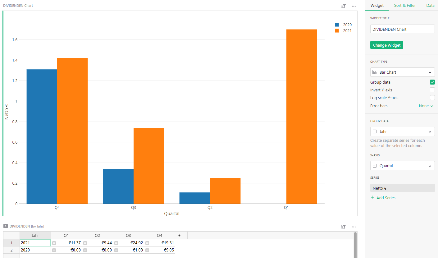
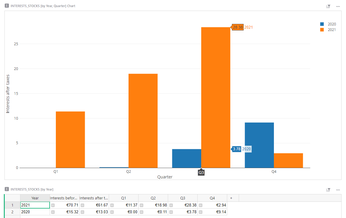
I cannot get the X-axis to display the quarters in order based on chart configuration alone, I’d consider that a bug in our system. However if I add an empty row to the source table with a date in 2020 Q1, then it fixes itself.