HI
I installed Grist Localhost and imported the data. I wanted to show status of service.
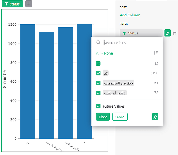
As you can see the Bar chart widget created the Chart but the Y axis is incorrect.
i have attached the screen shot. 4 Statuses exist.
First status has 12 record
Second status has 2190
Third has 51
Fourth one has 72
But if you look at the Bar chart all four has similar Y axis height and number.
Can any one explain how to fix this?
The main configuration for a chart is in the “Widget” part of the creator panel. A chart shows single records actually (i.e. each bar is a record that say for this x-axis label, show a bar with this height), and when you intend to add up across records, you should check the “Aggregate values” option. It automatically creates a summary table to serve as the chart’s data source.
The “Aggregate value” option is available right under the “X-axis” setting (shown here Chart - Grist Help Center). Usually it gets turned on automatically, but I am guessing it’s off in your case.
Two other suggestions:
- Keep in mind that the filter dropdown is showing a count of values, while the chart is showing the value of
S.number field.
- The best way to understand what’s wrong with a chart’s data is look at “Show Raw Data” for it (the option available from the widget menu, as shown here 2022/08 - Grist Help Center).
