Hi, like everyone here, I love Grist. Here is a suggestion which I think could improve usability.
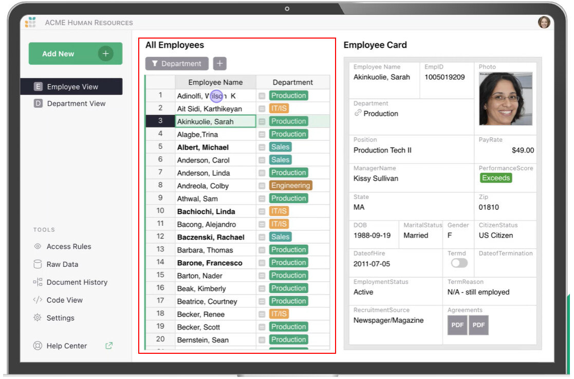
When multiple widgets are linked together on a form, the left most widget tends to act as the record selector.
I see a few drawback with this:
- This widget typically takes 25% or more of the total screen real estate.
- Once the record is selected, this part of the screen becomes underutilised.
- Deciding what columns to include in that widget is always a trade-off of essential information vs screen space.
- Using SELF_HYPERLINK() to automatically jump between related record makes manual record selection even less needed.
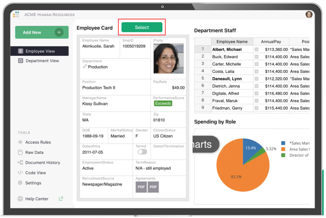
It would be great if a record selector button could be added next to the primary widget of the page which would open a popup widget which functions as the record selector
The benefits I see are:
- It maximises efficiency of screen real estate
- if helps Grist feel more like a database to users
- if the record selector widget was a popup then there wouldn’t be the need to economise on the fields shown (you essentially now have the whole page width)
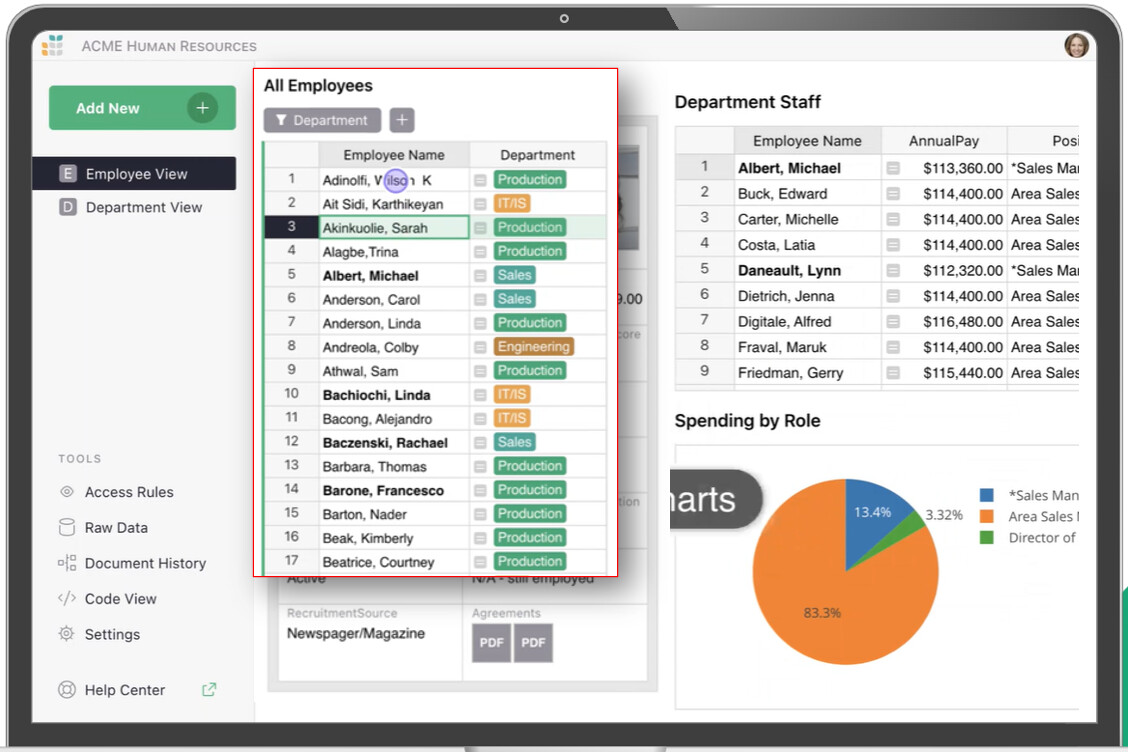
FYI, after a suggestion by Dmitry, we can already sort of do this by minimising the size of the record selecting widget to virtually zero then expand it to select the record, but it’s clumsy and not intuitive.
Thanks for your consideration, David.
5 Likes
+1 I have similar design where I put a widget for selection only.
Such fonction would help saving spaces and focusing on most important information.
1 Like
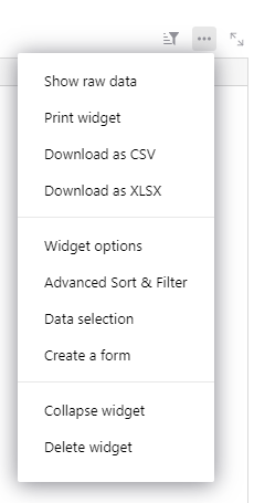
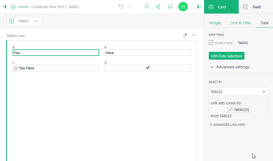
What about “Collapsing” the selector table? (in the 3 dot menu)
You can still use it as the “select by” target, it goes full-width, and it stays out of the way.
Yes, it makes sense for people used to working with grist, but for the casual end-user it’s not intuitive.
about the pop-up… do you want it to act like a normal selector, but in a pop-up form? Meaning… while you select different records, the screen below the pop-up changes to reflect that record? Or your idea is more like another screen where you make a selection and then go to that record?
- This widget typically takes 25% or more of the total screen real estate.
- Once the record is selected, this part of the screen becomes underutilised
My initial solution (considering what we have today, not the ideal one) would be to have a screen to select records and another to see the records.
So the first screen where you have the record selector occupying a portion of the screen would show only a summary of the information of each record. Objective is only to help find the needed record. When you find it, a self hyperlink takes you to another screen without record selector, with all the info about that record.
My preference would be the first option you suggested,
This way you keep the searching and editing within the same form. Otherwise there would be a significant increase in forms
I’ve made a simple drop-down widget. Maybe that could be useful
https://antol.github.io/grist-widget/drop-down/index.html
Hi Antol,
this looks interesting. However after adding the widget and selecting the column there are no records showing. Could you perhaps supply a demo.
Hm. I was trying to fix a bug with a minimum height (Custom Drop-down Widget: Minimum Height Issue - #2 by Travitron). And probably I broke down something. I will let you know when I fix it
I’ve fixed it. Try it now.
But the issue with minimum height is still there
1 Like
The issue with minimum height is fixed in the next grist-core version (1.1.18 should be). Tested it on the latest tag
Great to see this height issue is fixed. It “unblocks” dev on a widget I’ve been working on! I hope to have it available for beta testing soon…