[Feature request] Support for color scales in conditional formatting

Hello there! Today I learned about Grist, thank you for this user-friendly and fairly powerful product. As an experiment, I tried migrating a couple of Google spreadsheets into Grist, and noticed the lack of “color-scale” conditional formatting:

I would love to see this feature in Grist tables - it makes numerical data so easier to grasp, especially percentages.

3 Likes

For context, there is also this “bar” kind of visualization as in Power BI:

image

But in my opinion, color scales are much more useful. I can however see a few use cases when bars would be preferable – slight differences in bar length might be easier to perceive than a slight difference in background color.

(side note: Power BI is a pretty good example for flexible conditional formatting options)

Continuing the topic of bar visualization, in Google Sheets it can be imitated with SPARKLINE’s, but of course, in this case it occupies a separate cell, which might be less convenient than formatting applied to this very cell / row:

2 Likes

There are sparklines anywhere for those with the eyes to see… :sweat_smile:

Jokes aside, this is great feedback! These kinds of at-a-glance visualizations are very helpful.

eh? How do you do that? Or am I missing the joke?

@Rogerio_Penna Simple, Unicode characters
https://docs.getgrist.com/4PbJHSqktWSo/demo-Sparklines?utm_id=share-doc

1 Like

I love @Evgeny’s simple solution, but mine was just:

chars = 10
total = int($A + $B)
lines = int(round(($A/total)*chars))
output = ""
for x in range(lines):
  output += "▓"
  chars -= 1
for x in range(chars):
  output += "░"
return output

Hmm, what if we add a feature like the following, without really any new UI but using formulas in the CELL STYLE section. Currently, the condition formula (in IF…) must return a boolean value, and the formatting will apply when it’s true. You can simulate a color scale by adding many conditions, but that’s very cumbersome. What if we allow the condition to take this form:

STYLE($Amount, range=(0, 10), mode="blend")

where mode can be “blend” or “bar”:

  • "blend" – the background color associated with this rule gets added to the previous color with opacity proportional to where the value falls within the range. E.g. in the example above, anything <= 0 is treated as 0 and adds no color; anything 10 or above gets full color; and anything in the middle is in-between.
  • "bar" – the background color associated with this rule fills in a proportion of the cell, depending on where the value falls within the range.

To achieve the first example in the thread, where you have different colors for positive and negative, you’d use two rules:

STYLE($Amount, range=(0, -1), mode="blend") # color RED
STYLE($Amount, range=(0, 1), mode="blend")  # color GREEN

To get an effect like Google Sheets SPARKLINE, you could do:

# default color BLUE
STYLE($Orchid, range=(0, $Orchid + $Rose), mode="bar")  # color ORANGE

Speaking of conditional formatting, please, consider my request to be able to move conditions order (like we can do with Options and many other things)

Boolean conditions depend on order. If you create like 10 conditions and must add one in the middle, you will have to copy and paste all formulas again plus the formatting.

1 Like

If using formula (which IMHO is the best idea), why not let it return:

  • either an HTML color name / color code;
  • or even a css snippet, that would let one define color / font weight etc.?

It could even be an alternative:

  • either a boolean (to be backward-compatible, keeping current behaviour);
  • or a dictionary, whose key would indicate which type of value is returned. For example: {css: "font-weight: bold; color: blue;"}

how to tell the system exactly how you want your color gradient?

Considering RGB, let’s say you choose first color 0,0,0 and the last color as 0,0,255

So the system will divide the color gradient in the 3 component colors and will increase each color by a corresponding value until it reaches the next color.

So let’s say in a case, I have if <=0, then 0,0,0, if >=100. then 0,0,255

At 50, exactly the middle of the gradient, the color would be 0,0,127

If my first color was 50, 80, 180, and the second was 100, 90, 220, then at 50, the color would be 75,85,200

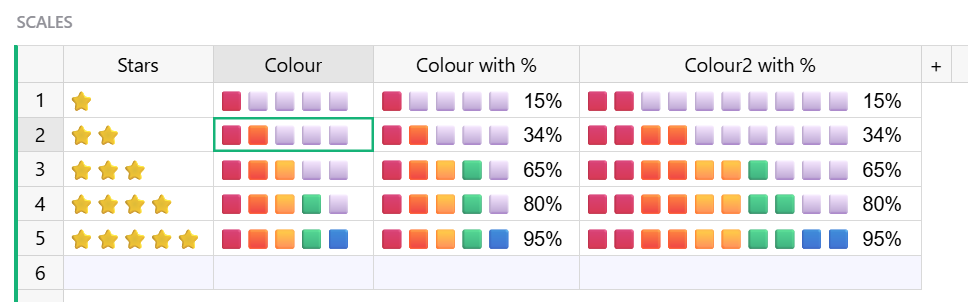
I like a solution with a formula overall. Also, if we expect the user to write a formula anyway, the range argument could be omitted and always be (0,1).

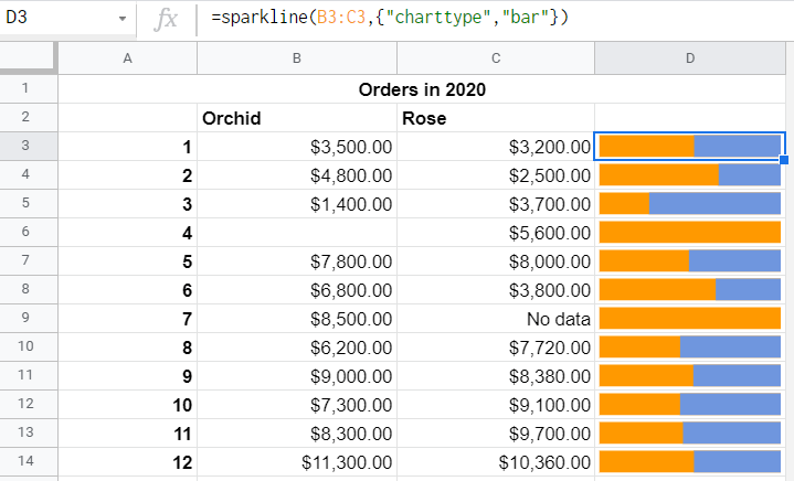
For the ‘bar’ mode, this will end up with:

STYLE($Orchid / ($Orchid + $Rose), mode="bar") // ✅

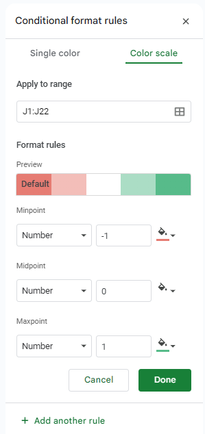
As for ‘blend’ mode, I am not sure that a nice looking color range can be obtained with just blending two colors. Recently I came across the colorcet project that claims to provide color ranges which make values most perceptually distinct. I took the green-white-red CET_D3 diverging color range as an example and got this:

import colorcet
import colorsys

palette = colorcet.diverging_gwr_55_95_c38
print(len(palette))

colors = [
    palette[0],
    palette[len(palette)//4+1],
    [round((a + b) / 2, 6) for a, b in zip(palette[0], palette[len(palette)//2+1])],
    palette[len(palette)//2+1],
]

print('\n# not linear in RGB')
print(*colors, sep='\n')

print('\n# not linear in HSV')
print(*([round(x, 6) for x in colorsys.rgb_to_hsv(*rgb)] for rgb in colors), sep='\n')
256

# not linear in RGB
[0.22157, 0.59107, 0.055073]
[0.61495, 0.77146, 0.52644]
[0.579235, 0.75428, 0.479422]
[0.9369, 0.91749, 0.90377]

# not linear in HSV
[0.281562, 0.906825, 0.59107]
[0.273127, 0.317606, 0.77146]
[0.272809, 0.364398, 0.75428]
[0.069021, 0.035361, 0.9369]

So I think a better idea would be to let the user pick one of predefined color ranges, and the column formula will then be

STYLE(($Amount + 1) / 2) // will have to map the value into (0, 1) range

The colorset project looks pretty convincing, especially on a map. Implementing that would mean devising some UI to pick from predefined color ranges. Would we have to choose which color ranges to offer, since there seem to be so many? (Choosing would be hard.) Would we still want to allow a gradient of arbitrary colors, like PowerBI does?

If we do go the route of building UI to select which color range to use to render a numerical value, we could include the choice of blend/bar in the same UI. In that case, the formula could maybe be just a number (e.g. $Orchid / ($Orchid + $Rose) without the mention of STYLE()).

Hello Dmitry! Sorry for a late answer.

Would we have to choose which color ranges to offer, since there seem to be so many? (Choosing would be hard.) Would we still want to allow a gradient of arbitrary colors, like PowerBI does?

I cannot recommend anything in this regard, both options would work for me. I believe, Google Sheets only offer predefined ranges, and I haven’t had problems with it. Giving the user a possibility to pick their own colors is also fine, but in this case I’d stick to your original proposal when the user only picks start, end and possible the middle color. I hardly see anyone defining a whole scale of 256 colors as in colorcet.

If we do go the route of building UI to select which color range to use to render a numerical value, we could include the choice of blend/bar in the same UI. In that case, the formula could maybe be just a number (e.g. $Orchid / ($Orchid + $Rose) without the mention of STYLE() ).

Yes, it makes sense.