The left-side Pages panel is great for organizing curated views like dashboards, filtered layouts, and reports. The problem is that it doesn’t directly match the document’s raw tables.
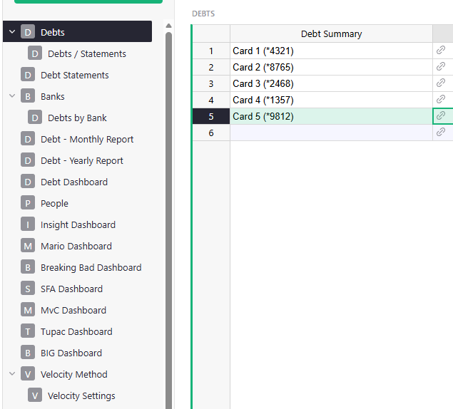
As a document grows (like in the screenshot below), a single table such as “Debts” can have many related pages: Statements, multiple Bank views, Monthly/Yearly reports, dashboards, and more. Over time, the Pages panel becomes long and cluttered.
If I just want to quickly open the original table (for example, “Debts” or “Debt Statements”), it’s mixed in between different pages.
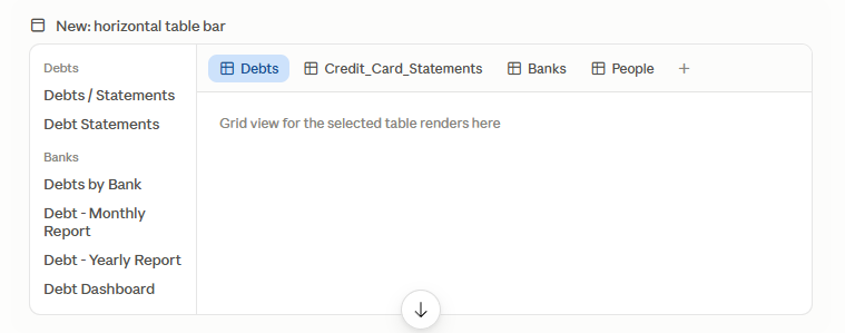
It would be helpful to have an optional horizontal bar above or below the main grid that shows the document’s actual tables separately from the curated Pages panel. Clicking a tab could open that table’s default/raw view, similar to how Excel or Google Sheets uses sheet tabs at the bottom.
This would make it much faster to switch between the underlying data and the custom views built on top of it.