I would like to make a heatmap calendar showing the number of entries from a table fo a given day of the year. Github shows a calendar heatmap to show user contributions and is useful to get a year overview in a quick graph.
Here is an example:
I would like to make a heatmap calendar showing the number of entries from a table fo a given day of the year. Github shows a calendar heatmap to show user contributions and is useful to get a year overview in a quick graph.
Here is an example:
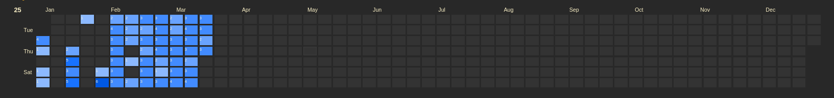
This was the closest I could get using the Advanced Charts custom widget: Heatmap - Grist
Couldn’t figure out getting the proper Y-axis ordering or X-axis month labels, so it doesn’t quite work, but maybe it’s a start?
Hi,
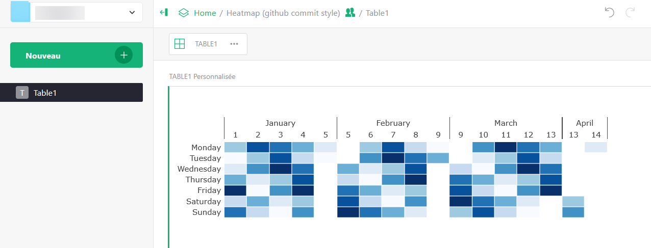
My 2 cents :
Something like this : Heatmap (github commit style) - Grist
And visually looking :
This heatmap looks quite workable. I see that it is a custom widget but I don’t see what custom wiget was chosen. Isn’t there a URL needed for a custom widget?
How would I duplicate this widget in my own document?
It’s the wonderfull “Advanced charts” based on the marvelous Plotly.
![]() Thanks both team
Thanks both team ![]()
Either :
This works beautifully! I very much appreciate the tips and guidance. I was not aware of the Advanced charts widget and will definitely use it liberally now that I know it exists!