I’m new to grist and this seems trivial but I can’t seem to figure it out. I have the following data
Employee Name
Total Hours Worked
Hours worked in category 1
Hours worked in category 2
Hours worked in category 3
What I want is a pie chart with percentages of hours worked across all employees by category
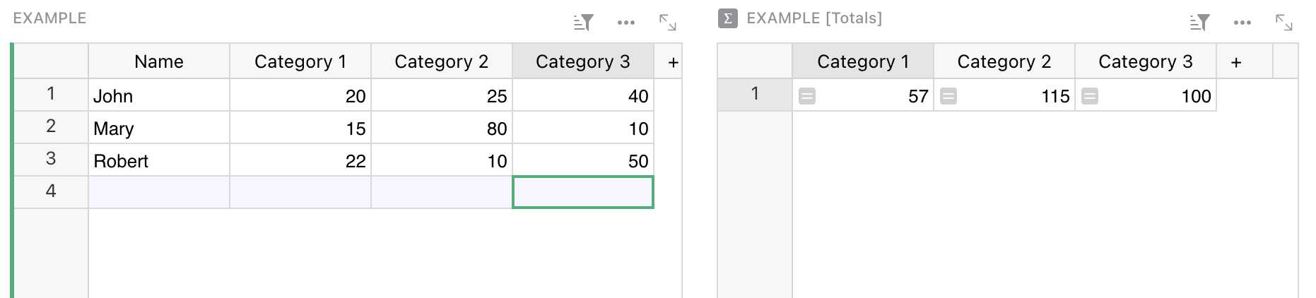
What I did was put these all into columns, I then created a summary table for the totals of each category’s hours.
So now I have a summary table with the sum of total hours worked across all employees separated by category. All I want to do is take these 3 sums and stick them into a pie chart to get percentages, however it seems like pie charts don’t work this way. The data needs to be vertical not horizontal.
I tried to reference the summary data, and put it into a new table but I can’t do that either
As you define three different columns, I guess you have a defined number of categories (otherwise it would be far better to have a Name, Category, Hours scheme for your Example table). Then you can afford a Categories table with Category, Total hours columns. The Total hours column would be a formula column with this formula:
Hi jperon! I am experiencing problems to open the posted sample due to access issues. Could you please take a look into it? The sample would be really, really helpful for me! Thank you!
Sorry, I just opened public access (I thought it was done before). I took the occasion to add another page that organizes data differently, but IMHO in a better (more normalized) way.