Improving the ActionButton

I would like to slightly improve the ActionButton, like follows.
Would you please help me showing where to change the code?
Thank you in advance.

Description as hover tooltip

Currently, if the description string is empty, the button is not shown.
I would put the description in a hover tooltip, saving a lot of UI space!

Allow for a list of multiple buttons in the same widget.

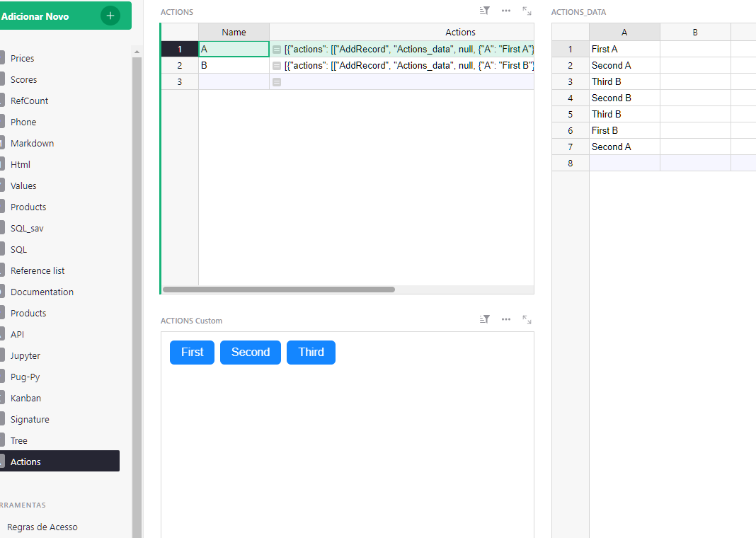
Currently, the ActionButton input is this:

  {
      "description": "Some description text",
      "button": "Duplicate",
      "actions": [list of actions to apply],
  }

It could become a list of dicts:

[
    {
        "description": "Description text",
        "button": "Duplicate",
        "actions": [list of actions to apply],
    },
    {
        "description": "Description text 2",
        "button": "Check",
        "actions": [another list of actions to apply],
    },
    {
        "description": "Description text 2",
        "button": "Send",
        "actions": [another list of actions to apply],
    },
]

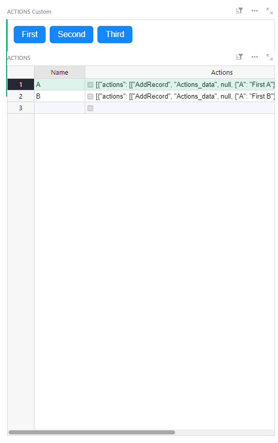
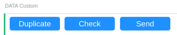
Here would be the result (without description):

Immagine incollata

For backward compatibility, I would like it to keep accepting a single dict as input, as it is now.

1 Like

There are two places where you’d have to make changes:

Okay, thank you. I am going to study your hints and report back.

Do you master Javascript / Vue ? Otherwise, I could try and make changes: I don’t master Vue very well, but it shouldn’t be that hard.

1 Like

In fact, I do not master neither Javascript nor Vue…
If you could try, I would be very grateful.

While at that, REDUCING the size of the Action Button Widget would be great.

Right now, there is this whole line on the top, with a title for the widget, plus filters, etc (it’s a BUTTON, you don´t want a title for the widget!)
Then a big space for what will be written then the button, then more space.

This button widget below… I can´t get it smaller than that.
image

I suppose that you can´t change the original files used by everybody?

i want to play with the files, but I am using Docker Omnibus.

So I guess unless I want to compile a new docker image, changing files directly is also out of the question.

So maybe I should replicate the Action Button, like ActionButton2, and using a custom widget with a custom URL?

Yes, we are trying to write a new custom widget.
Only Grist developers could decide about official integration of the changes.

Here you are:
https://docs.getgrist.com/dd1Amj8bbHzK/Tests/p/23#a1.s135.r1.c219

Before the PR gets discussed and perhaps merged, there is a preview URL (to type in the Custom URL field):
https://deploy-preview-124--boisterous-sunburst-a5c941.netlify.app/actionbutton

3 Likes

OMG JPeron!!

JPeron, I was trying to make the widget smaller… but all the changes to the CSS resulted in only changing the button text size and left margin.
image

I suppose changing the widget to remove that whole big space above the widget box, as well as all as reduzing the size of the box can´t be done through the CSS?

For example, allowing the widget to be only this high (to do this I had to put it over the table widget and then increase the size of the table widget, but it is weird, you can see it overlaps the button widget. And ANYWAY, if I want the buttons below the table, then they have a minimum vertical size and youc an´t make it smaller.

Yes, I saw that also for other widgets: there are minimum dimensions for a widget, event when the content is smaller.

Well, just the fact you removed the need for the description already made your Action Button better, even if someone uses a single button

It’s amazing what you did.

This is exactly what I need to change a status column and manage a flow. I am going to post an example, and perhaps contribute some documentation for the ActionButton, that is currently missing.

I hope that this gets integrated into the main grist-widget repo.

Thank you again.

PS if you pass in Genoa, Italy, I invite you to be my guest!

1 Like