We really liked that when clicking at home to see all documents available, they were grouped by folder/workgroup (not sure what term was used in English)
Now, clicking at home shows absolutely ALL documents without any organization. You can at most order them by Modifying Date or Alphabetical order.
1 Like
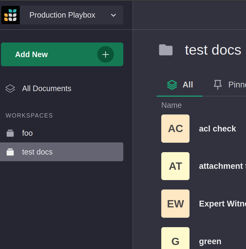
The left sidebar should show your workspaces and if you click on one you should see just documents for that workspace.
Yes, but then I have to click on each group individually.
the full view (of all documents) where they were separated by groups was really nice. I think the full list of documents without knowing to each group they belong to quite useless, to be fair.
Maybe some people like it, but I would prefer to just have a checkbox to group by Workspace
Hello thre  !
!
Agreed with Rogerio :slightly
Possible short simple first amelioration:
- putting pinned document as default choice when landing in home page (not recent as it is now)-> it helps for most seen docuent
- Live search for document in all tab
- Being able to sort manually or ascending/descending docs, keeping them in the same position
These are immediate short ideas, mayby to develop but I agree that the exceptionnal Grist app deserve a more ergonomic landing home usuer page 
Have a nice day and take care of yourself.