Often i want to display many data on a single graph, but they all vary over very different ranges, eg. some 0.1-1.0, some 10-1000. I still want to see all of their trends, but keeping one y axis means the lower one is squished to a flat line at the bottom.
The reason I want to use only one graph is to save space.
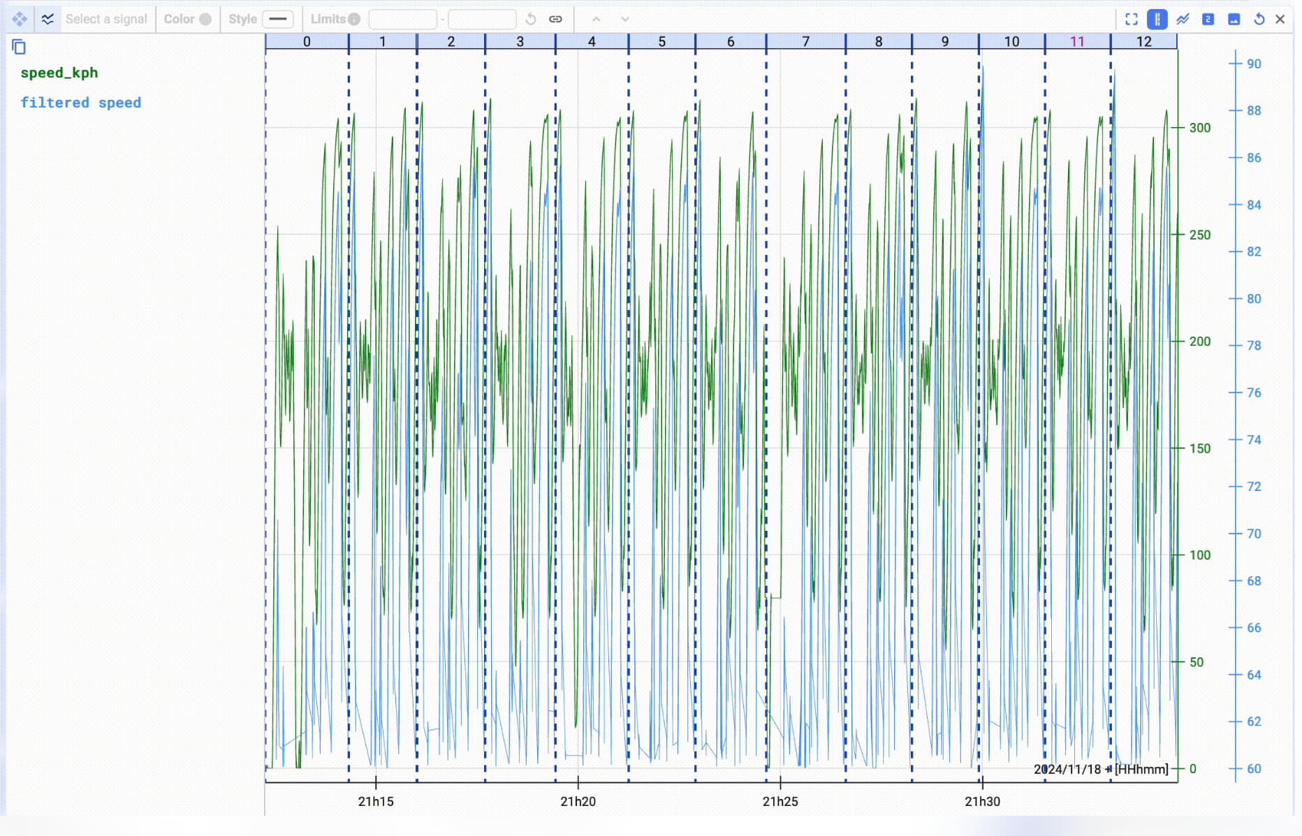
I use another software called Marple data that does this very well for timeseries data, here is an example, ignore the busy lines but look at the axis labels on the right hand side. Each signal has its own axis and they are superimposed on top of each other in the graph. this way you can easily see the trend of both.