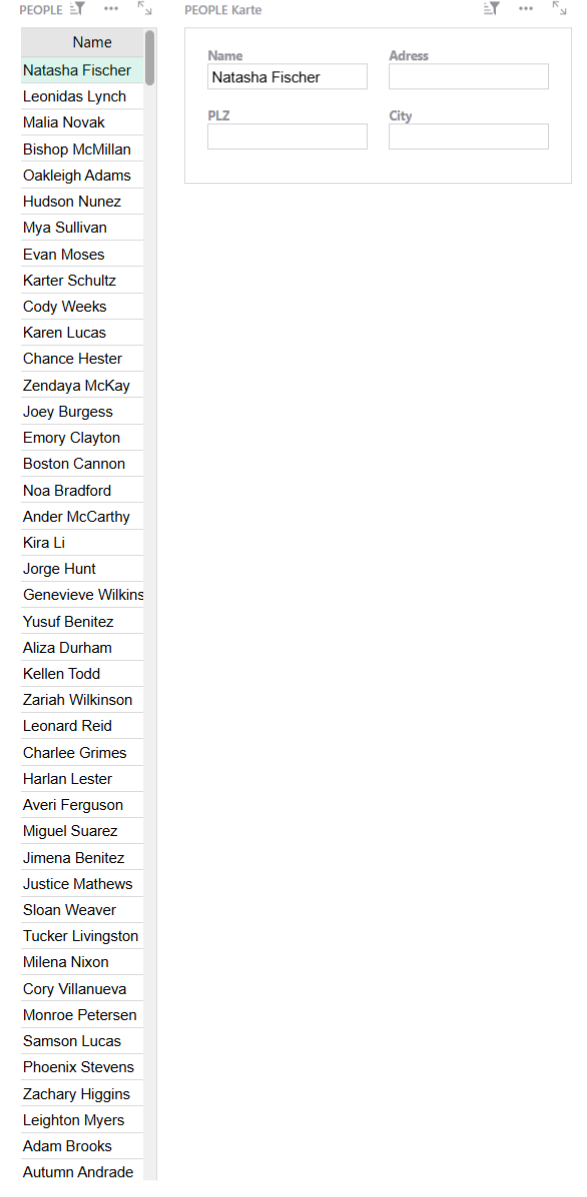
Many of our documents are structured in the same way. A long table of names on the left and card widgets on the right with more informations on the right. Our contact list works that way, for example.
It would be nice-to-have if the table view could be even more simplified. For most of our purposes, we don´t need the row numbers, once the view is set. That way we could use a tiny bit more vertical screen space.
The compact card list widget comes closest but it also offers a row count and repeats the field name, which isn´t really necessary for us. But it´s nice that it has no vertical scroll bar.
A simple list without any functional extras would be a nice and clean.
Just a nice-to-have.