One of the advantages of self hosting is you can tweak the interface. I have made a few changes which I think use the available screen space more economically among other things. This is especially important if users have computer screens with lower resolution, which is common in developing countries.
The downside is that every time there is an update, I have to manually re-apply the changes to some of the css and Typescript files. Although I have it pretty down pat now, I would obviously love some of these to be incorporated into main Grist.
This post is basically to gauge if there is any interest from other users, or if they are just my own preferences.
Here is a working copy using the Project Management template demonstrating the changes:
Open Project Management
-
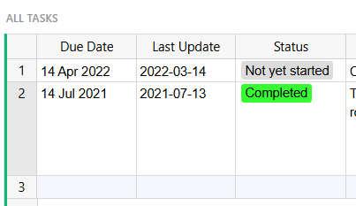
Table Row Number - narrow width to fit numbers up to 9999. Most of my tables have less than 100 rows, so there is a wasted space on every table. Ideally this column could expand to accommodate Table widgets showing huge numbers of records.
-
Table Add Column - hide this unless you are the owner as it is just wasting space and causing horizontal scrolling sooner than necessary. Ideally this would show/hide depending whether you have permission to modify the access structure.
-
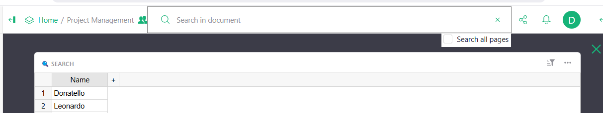
Collapsed Widgets - changed the fixed widget bar at the top of the screen so it is collapsed by default, but expands on mouse hover. A green line shows if the page has collapsed widgets. This way you get back the whole section currently used by the collapsed widgets bar, which may only have one or two widgets in it and be mostly empty space.
-
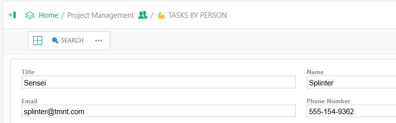
Search Widget - Name a Table widget “ SEARCH” and collapse it so it sits in the collapsed widget bar. When you click on the widget, it will automatically move focus to the search box so users can immediately start typing their search string. I find users often didn’t see the green magnifying glass - it also saves a mouse click.
-
Tables sort order in Access Rules - currently, access rule tables are displayed in the order they first have a rule applied to them. This becomes a pain when you have many tables with rules and they weren’t added alphabetically. This tweak sorts the tables alphabetically. It is literally changing one value from false to true, so should not be too hard to implement.
-
The exact same thing applies to Code View - so I made the same change there too.
-
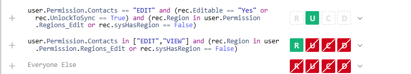
Access Rule Conditions - if you have complex conditions, they don’t currently word-wrap, making it very easy to make simple logical errors. This change just turns on word-wrap, making Access Rules a pleasure to work with again.
I’d be interested to hear people’s feedback, or ideas for other visual tweaks. I don’t know if there is a voting feature in this community, but perhaps something like:
1-yes, 2-yes, 3-no, 4-no, 5-yes, 6-no, 7-yes and any comments/suggestions.
Regards, David.
6 Likes
Great ideas! I’d like to test them & give feedback: did you publish them to some fork?
Love all your proposals. We have small screens here…
What about submitting a pull request to the devs?
I love most of your proposals.
For #3, I would personnaly prefer a compact alternative which would keep the table names.
A big YES for all others 
KR.
1 Like
Another thing I would encourage you to consider, if you want to avoid making the same changes every time, is that you can create a Dockerfile that pulls the base image (gristlabs/grist) and then modifies some of the files via a script.
For example, I want to have the notification that pops up during a forbidden change be red. So I have a file scripts/hotpatchcss.py, which inserts a rule at the top of bundle.css that says '--grist-theme-toast-memo-bg: #CC0000 !important;'.
And in my Dockerfile:
FROM gristlabs/grist

COPY scripts/hotpatchcss.py /hotpatchcss.py

RUN \
python3 /hotpatchcss.py
1 Like
How do you change the interface?
have you mapped the files that can be changed?
For those interested, here is my current fork: GitHub - teebase-net/grist-core at custom-ui
This fork builds fine on my VPS, but I run into errors above my ability (I’m not programmer) trying to submit PRs. Any help in how to do this wold be much appreciated as I think some of these are features that everyone would benefit from - especially wordwrap in Access rules and alphabetically sorting Tables in Code and Access Rules.
I like how I’ve got the collapsed widgets bar working (LayoutTray), but realise it might not be for everyone.
Files which affect each feature
-
Reduce width of the Table Row number
/app/client/components/GridView.css
/app/client/components/GridView.js
-
Hide ‘Add Column’ in the Table widget unless Owner - ideally this would be done better by using the “Permission to Edit Structure” rules, but I couldn’t figure out how to do that.
/app/client/customindex.js
-
Change the behaviour of the Layout Tray (where collapsed widgets are stored) to use the screen space more efficiently
/app/client/components/LayoutTray.ts
/app/client/components/GristDoc.ts
-
Automatically moving focus to the Search box when opening a collapsed widget named “ SEARCH”
/app/client/components/LayoutTray.ts
-
Sorting the Access Rules tables alphabetically
/app/client/aclui/AccessRules.ts
-
Sorting the Code tables alphabetically
/app/client/components/CodeEditorPanel.ts
-
Enable word-wrap in Access Rules conditions
/app/client/aclui/ACLFormulaEditor.ts
thanks a lot… wow… I would like to try to mess with that… but my Grist is in production, I would die if I broke it.
I hear you. I have two instances of Grist on my server dev and main (production). I do all mods on dev and when I am happy, I sync that over to main.
I installed my Grist with Docker. I think I once tried to install two instances of Grist (or was it XWiki) with Docker and had problems with it
I use Portainer - I can share my stack yml if you are interested
It’s great to see that some of these suggestions have been incorporated into standard Grist:
Access Rules and code Tables sorted alphabetically
Access Rules word-wrap.
I have added a few mode modifications:
-
Share button can be hidden. Without this there, there is really no data security as any user can download the whole database.
-
Delete Record and Delete Widget in menus is formatted Red to prevent accidental deletions. Never accidentally delete a widget again 
The url for the sample document has changed: Project Management
Here is my current fork: GitHub - teebase-net/grist-core at custom-ui-1.7.3
1 Like