I have a case when doing summary table by two fields: data field and formula field which returns text can’t be saved and doesn’t aggregate values.
And why I want to do this?
Because I want to have one chart that I can filter by service.
When I aggregate only by date i don’t have an option to filter by this field.
My table is something like that:
I want to aggregate data by yearMonth and serviceMain and value by marginDup.
So it will show me aggregated values for my services by year Month.
So I created table
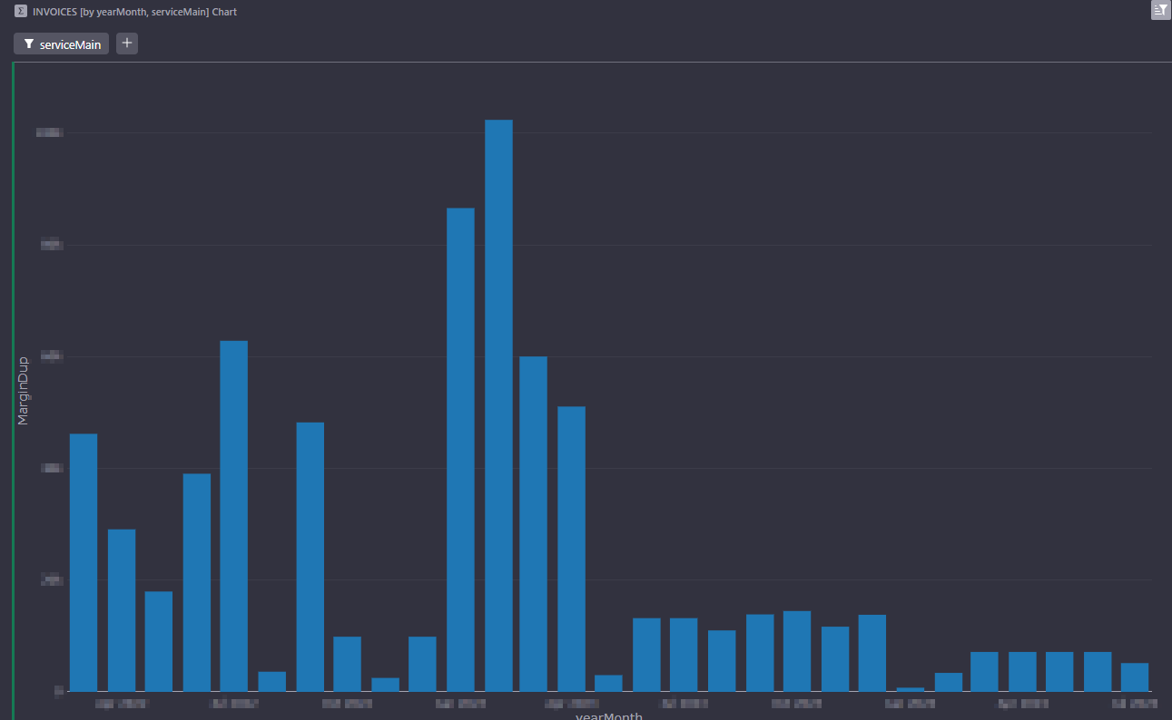
When I have checked all service chart return this:
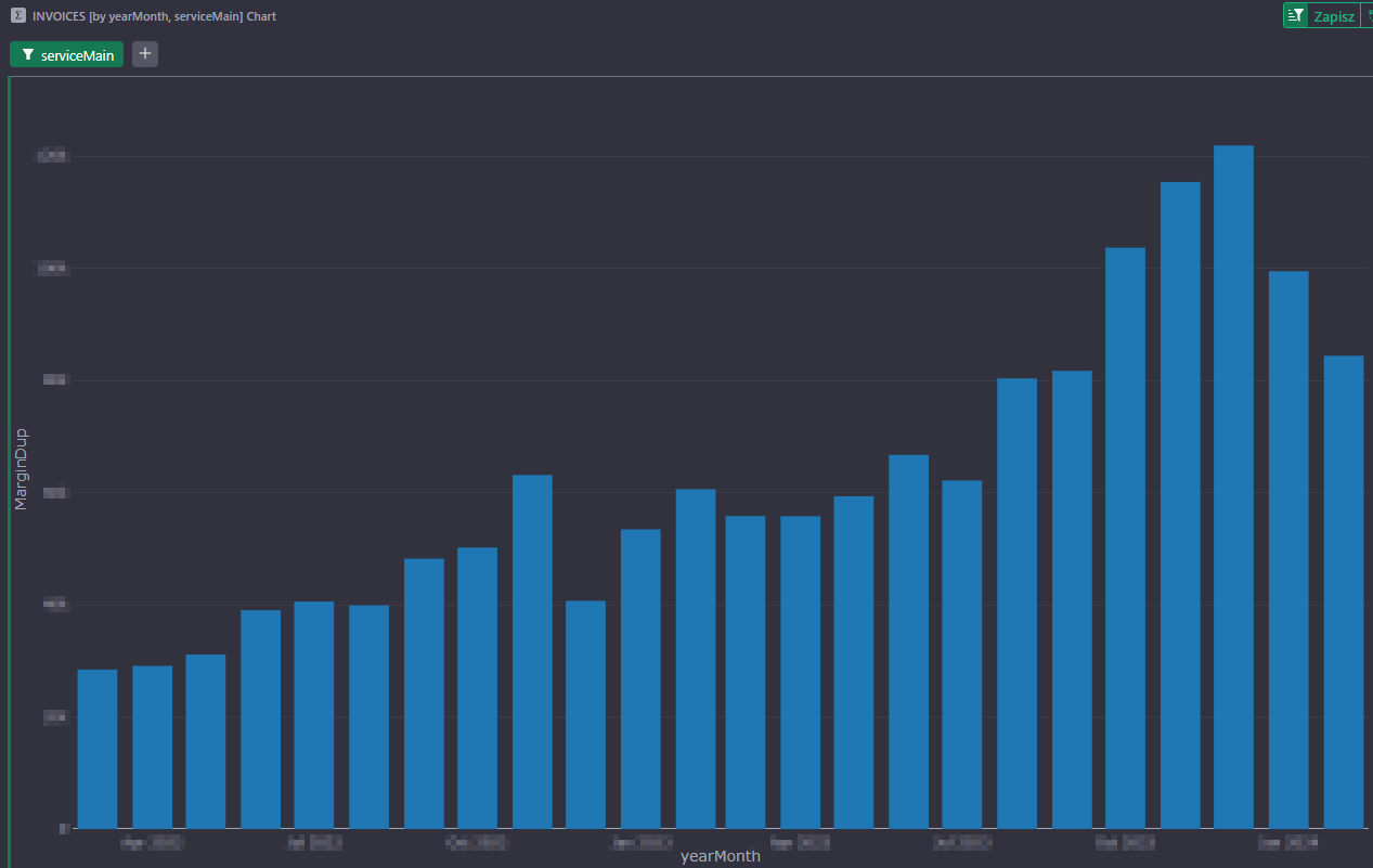
Hi! I think what you are seeing is that the data for the chart has several numbers for each yearMonth (one number for each serviceMain value). In the second chart, filtered for a single serviceMain value, it’s one number per yearMonth, so everything look correct. In the first chart, there are several numbers, and Grist looks like it’s picking one value to plot – probably the value for the first serviceMain it encounters (but I am not sure).
This has been an issue with charts, which we haven’t found a good way to deal with. The best suggestion I have is to select the “Split Series” option, select serviceMain in the Split Series dropdown, and probably also select the “Stack Series” option.
Then all the different serviceMain values would be stacked in each bar, so the total bar should become correct.