Hey  ,
,
I am wondering why it’s not possible for Summary tables to contain non-formula columns.
I wanted to add a toggle column.

Thanks
Hey ,
I am wondering why it’s not possible for Summary tables to contain non-formula columns.
I wanted to add a toggle column.
Thanks
Hi Sao,
The primary purpose of a summary table is to aggregate rows from the source table. So behind each row of the summary table are a group of rows form the source table. This is why each column must be a formula column capable of computing the aggregate from a group of rows, for instance =SUM($group.Quantity) (if the source table had a numeric column Quantity).
Why did you want to have a non-formula column, is there anything specific you’re trying to achieve ?
best,
This is a classic case. Airtable and Smartsheet both support it.
Effectively, we want a presentation that sorts by a category field, but instead of repeating that field’s value, let’s call it , over and over in every row, there is a sort of section head that has the category value, let’s call it , with all of the dog rows thereafter. Then a break at , followed by cats, etc.
There is a break at each change in the value of where a new heading is introduced. This ONLY contains the category field (and if linked to a category-describing table, perhaps something about the category like count of records, mean, max, min, who the curator for the category is, etc.) The heading “form” might include some special formatting like a page break, a heavy border, etc.
This feature request is primarily about reporting. It is perhaps time to do a reporting widget. It can be printed sensibly, but can also be used as (for some) a more easily understood, familiar presentation of data that enables editing (like a card list widget) for appropriate fields. You might also think of it as visually integrating a summary table and the detail table.
The reason you seem unable to imagine what the original poster is trying to achieve (very politely to be sure) is that entire team has a blindspot around visual appearance. You only think in terms of relational algebra (which has lead to good performance and some good features). You’ve made relational algebra accessible.
It is time for you to focus on APPEARANCE (as I suggested in another post). Not cartoon-like appearance, such as competitor Stackby seems to emphasize, rather focusing on sensible layout, formatting, and smart controls. This includes widgets that can appear and disappear (they way Airtable handles built-in cards, for example): to bring up a form or a chart or even pivottable–but only on request–rather than being statically part of the page layout.
This stuff is hard to prioritize and can be expensive to do. So, perhaps the focus should be on grouping records (really just a sort that doesn’t show the sort field value in every row), reports (mostly to screen, but still sensibly printable), and touch controls to bring up widgets. Build some templates using these; see what the customer reaction is, and then go from there. You’ll find it is a way to use screen real estate more economically. Think of that as the logical rationale and not a noob’s request for non-technical “fluff.” You guys are much too polite and conscientious to express that or possibly to even think it. Just look at things from the perspective of how presentation aids usefulness, clarity, and economy.
Hey  ,
,
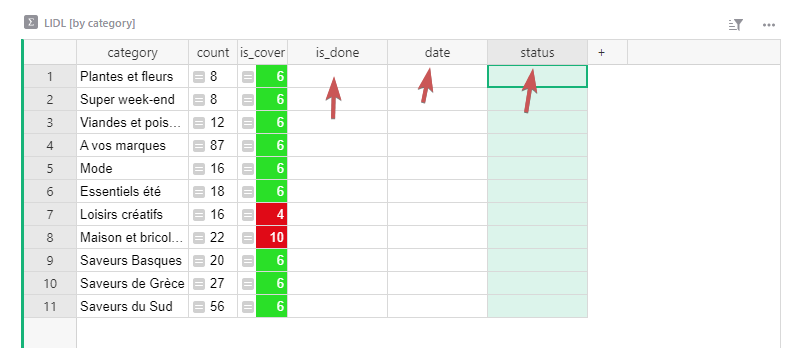
So I have products that I did a "groub by " the Category column.
I need some non-formula columns when the user has finished the task for one category :
Hi Sao,
Thank you for the screenshot, now I see better what your trying to achieve. The good news is that it’s possible to do with Grist but not with the Summary table.
Here are the steps to follow (I’ll aso include a link at the bottom to a document that demonstrate the structure)
count with formula = len(Tasks.lookupRecords(Category=$id)).Why does it work ?
It works because under the hoods summary table are powered by formula too, so it’s possible to emulate what a summary table can do on a regular table using formulas. Only the summary table makes it easier for you.
More ressource
The main reason you can’t add data to a summary is that rows are not ‘stable’, they are dynamically added and removed based on the source table data.
Suppose you create a new row in LIDL with category set to Mod. Then you set some values in the data columns of the summary table like date. But then you realise you made a typo in the original row and change category to Mode. Now there are no source rows corresponding to Mod, so that row disappears from the summary table. What should happen to the data that you put there? What if it’s something important that shouldn’t be lost?
You can convert a summary table to a normal table by detaching it: Summary tables - Grist Help Center
This will keep the existing data and formulas so nothing will immediately change, and you can now add data columns to the table. But because it’s not a summary table, rows will no longer be added automatically when new data is added to the source table.
Alternatively, you can create a new normal table with the same group-by columns (e.g. category) as well as the data columns you want like date. Then in the summary table you can add a formula like NewTable.lookupOne(category=$category).date to show the extra data directly in the summary table. But you will still need to manually add new rows to the normal table, and ensure that you don’t create duplicate categories.