Buttons for EDITING and SAVING records

In this thread, I suggested how to block deleting a record if it has child records, thus protecting it from leaving orphaned child records. It would use a status column that counts child records and if status is 0, then based on User Permissions, the record is free to delete. If status is 1, it’s blocked.

I am wondering if a similar system (of a STATUS COLUMN) can´t be created to fullfill a problem in Grist and other “Excel like systems”: it’s too easy to accidentaly change a record without noticing what you did. Because every record is open for editing.

Most business systems will have buttons for you to edit a record already saved. And another to save the record being edited.

I THINK the first part can be done in the following way. All records are closed to the user. They have a column for “status”, where depending on status, user can´t edit them.

I guess that will also make it impossible to CHANGE the status so you can edit the record.

But MAYBE an ACTION BUTTON can change the status to “editable” even if the user can´t directly change it.

So user select record he wants to edit, click the action button on top of the page called EDIT, and action button changes the status of the record, so the record is now open for editing.

As for saving. No idea really. Anytime you type anything in any cell, it already saves it.

A possible solution would be to also have a column status where the record is in status EDITING unless user clicks “SAVE” Action Button. While in editing status, the record won´t be available for calculations, etc. It’s like in Limbo.


ps: I wonder if an easier way to do all that can´t be automatically available. Including automatic hidden columns (just like the ID column of tables), small EDIT and SAVE button widgets already connected to right columns… and possibility of enabling and disabling this feature, per table or widget.
This makes a lot of sense, but I wonder if it’s better to offer it as a property of the data (a column determines if a record is locked, access rules determine permissions), or if it’s better to offer it as a user-interface option. Here is what I imagine for the latter:

  1. Allow a widget (e.g. a table) to be marked read-only. So even if you have permissions to edit, it behaves as read-only.
  2. Introduce a variant of Card widget, which behaves like a typical application record: it is rendered in “view” mode (i.e. as text rather than form fields), has an edit button to turn it into a bunch of form fields (“edit” mode), and a save button to save and go back to view mode.

So for application-like views, you’d set up a page with two widgets: a read-only table to select a record, and this new card widget for editing. There are no access rules; it is only a change at the UI level. The editing flow would be as you describe: select a record, click “Edit” in the card, make changes in that card view, then click “Save”.

What do you think?

1 Like

I would love to have View only mode to prevent accidental edits of data. This would potentially be a step toward another feature I’d really like which is to search for a record in card mode by typing in a field.

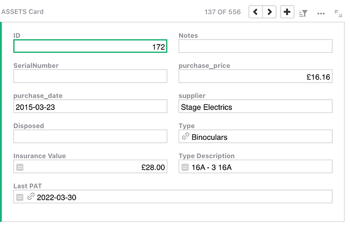
For example on this card

I’d really like to type 520 in the green box to go directly to asset 520 without clicking on the > arrow 520 times!

This is particularly true on mobile where big tables don’t work very well and accidental edits are all to easy.

Mark

Yeah, I already posted about the clicking through cards issue, which is hard when you have hundreds of cards.

I am not very sure however that your example is the best one. For one, you can have filters to search the card with the number you want. Second, a workflow where you search by typeing directly in the field is something I have never seen in any system.

My idea for a card system is useful when you DO NOT know the card. So you can type directly the approximate number of the card and then move back and forth between cards in that approximate position until you find yours (let’s say, you know it’s card between 500 and 550, out of 1000.

Another possible assistance with cards would be to generate a list with small text concatenating or showing a single field of a table, then you click on the card changer button and it generates a list with pages…

Here are some suggestions by ChatGPT
There are several user-friendly UI design solutions to address the issue of navigating between cards representing records. Implementing one or more of these methods can significantly enhance the user experience. Notice some are useful for the LIST OF CARDS, not single card widget. I will mark the list of cards in italic.

1. Pagination: Divide the cards into smaller chunks, displaying a fixed number of cards per page. Provide navigation controls to move between pages, allowing users to jump to a specific page or skip multiple pages at once.
2. Infinite scrolling: Implement a mechanism that automatically loads more cards as the user scrolls down the page. This reduces the need for manual clicks and allows for a smoother browsing experience.
3. Filters and search: Implement filters and a search bar to help users narrow down the cards based on specific criteria. This will allow users to find and access the desired card more quickly without having to navigate through a large number of cards.
4. Jump to card: Provide an input field or a slider where users can directly enter the card number or a percentage value to quickly navigate to a specific card in the collection.
5. Sorting options: Allow users to sort the cards based on different attributes, such as date, title, or other relevant criteria. This can help users locate the desired card more easily in a large collection.
6. Keyboard shortcuts: Implement keyboard shortcuts (e.g., arrow keys, Page Up/Down) to facilitate quick navigation between cards, enabling power users to browse more efficiently.
7. Overview or grid view: Provide an alternative view that displays multiple cards at once in a grid or list layout. This allows users to quickly scan and locate the desired card before selecting it for a detailed view.

Overview or Grid View already exists, as well as filters and sorting options.

Keyboard shortcuts are interesting. Page up or page down to change 10 cards at once… 1 - 11 - 21 - 31 - 41 etc. Right now Page Up and Down change one card at a time because the arrow keys move through fields.

The pagination would be interesting for List of Cards Widget.