Could you make it possible to add additional bar chart styling features?
Such as:
chart color
a highlight function (e.g.: highlighting the bar that is related to the current month)
showing the values per default and not on hover
3D + shadow option
Additionally, if there are too many values to display a bar chart without looking ugly scaled, would you consider adding a horizontal/vertical scroll bar?
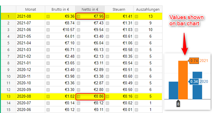
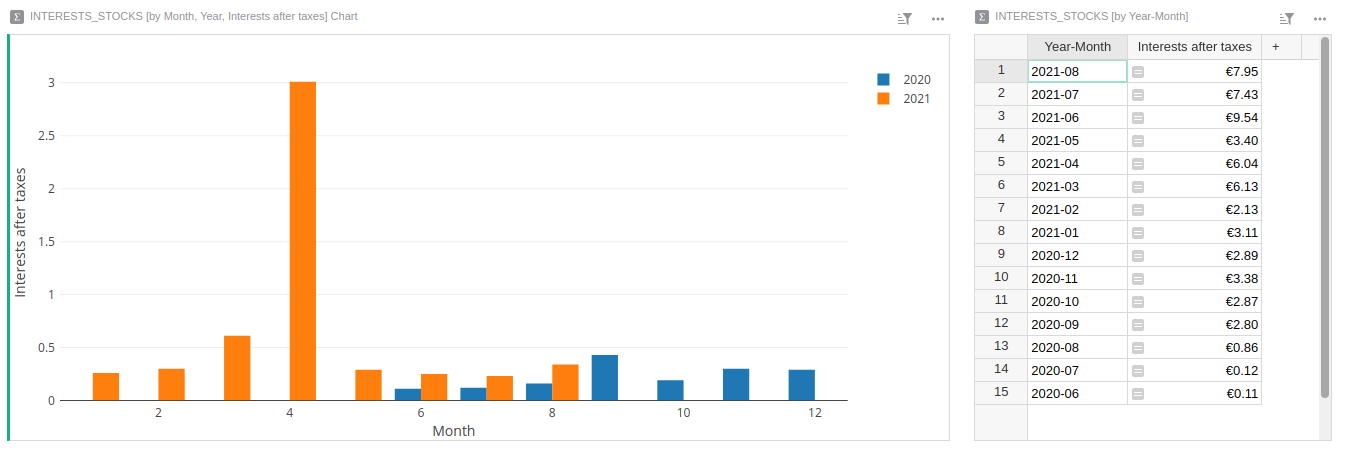
Also, I would like to mention that sometimes the bar-value shown seems to be incorrect. For example: I have €7.95 as the sum of values within a specific month. If I create a bar chart, it does not show me that value. As shown in the image below.
We’ve noticed similar sounding issues with chart totals recently and made some changes. Tell me if my guesses are correct:
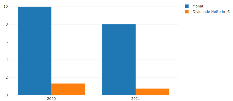
The table shown on the left is a summary table.
The chart’s underlying table is not a summary table, but rather the source (i.e. unsummarised) table of the summary table
Changing the widget of the summary table to chart (or adding a new chart and setting the data to the same summary table grouped by the same columns) produces a chart that looks correct
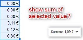
0.34 and 0.74 are the values of single cells in the source table, e.g. adding 0.34 plus the other value(s) for 2020-08 gives 0.86.
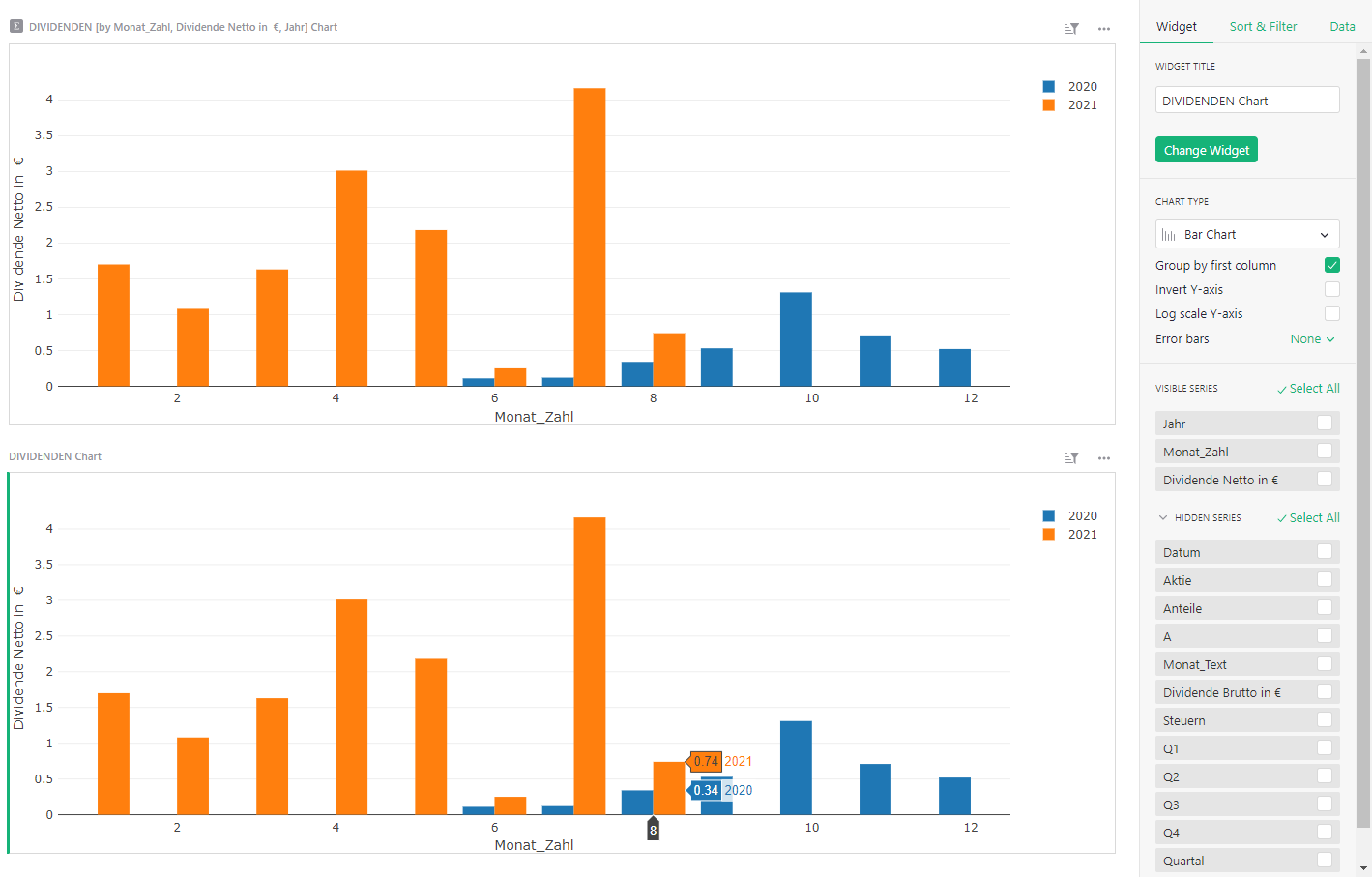
I duplicated the chart in the following image. The upper one has a summary table (settings in the next image), the lower one utilizes the fundamental data table, not a summary table.
Unfortunately this didn’t create the expected result.
I added a summary table as a widget that displays year-month + number value.
I then added a chart with the base table displaying the year, month and number value. It’s grouped by first column “year”. I added the previous summary table to the select by function. This produces a single bar plot for each month. If I deselect this, then I get the normal bar plot with the incorrect sums. I assume I did something wrong
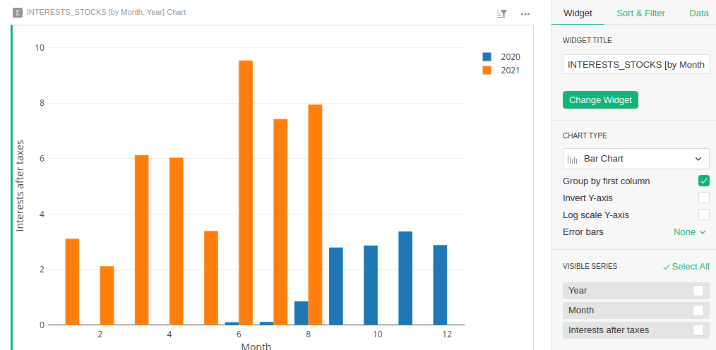
It looks like your upper chart which is based on a summary table is not using the same summary settings as your original correctly working summary table. The chart is grouped by an extra column “Dividende Netto” which you’ve then used as your y-axis. But grouping by a column in a summary table means you’ll get a separate row for each value in that column, not totals.
Note that “group by first column” in charts means something quite separate from the group-by columns in summary tables.
I am not sure whether I understand you correctly - but that is no problem!
Let me briefly explain the bar chart output I would like to create:
x-axis maps to month
y-axis maps to interests after taxes / “Dividende Netto” ⇒ Here, I want the summarized values displayed as shown within the INTEREST_STOCKS table on the right side
I want to have a data series for each year
I’ve set year as the first column. If I uncheck the “Group by first column” option, I receive the following plot, which is not the output I want to create.
Sorry, that last comment about “group by first column” was just meant to be a sidenote, I distracted from the main point. The problem is that in this picture:
INTERESTS_STOCKS [by Month, Year, Interests after taxes] Chart
and
INTERESTS_STOCKS [by Year-Month]
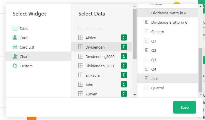
and it’s not the Month, Year vs Year-Month part. You want the interest values to be summarized, but grouping by that column specifically means it won’t be summarized. Use it as a chart series, but not a group-by column for the summary table. Here’s what the correct settings look like:
The newly announced Advanced Charts custom widget lets you control the styling much more, including configuring colours and showing values (or other text in your data) on each bar without having to hover.