Help with Charts. Can´t add more series. And other questions

So, I have this data for KPIs
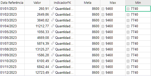
image

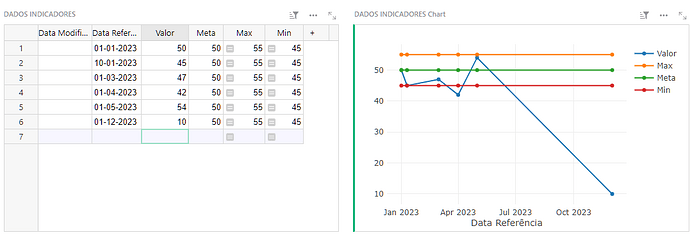
I inserted 3 series… value of the KPI (or Indicator), Target or Goal… and Positive Tolerance. But for some reason I CAN NOT add the Negative Tolerance series!!

EDIT: just solved it. It was set as text. Changed to number and now I can add it.


Other questions… is it possible to have “rounded curves” with the Line Chart? Or eliminate the filling (and be left with round curves) in the Area Chart?


Is it possible to change the color of each series?


Is it possible to control a chart widget based on choices from a table?

Example: I have multiple KPIs in a table. That table tells the name of the indicator, the DIRECTION (higher values are good or bad?), the periodicity, target and upper and lower tolerances.

Then I have a table for data of those KPIs.

I want to create a page where I select the indicator and it shows a chart for that indicator.

But the chart widget is static i guess. I can´t tell it to be inverted or positive based on the KPI table. I can´t change the TYPE of chart based on the KPI table choices.

Or can I? Through some python trickery? :slight_smile:

Btw, if there is no way to change chart type, or direction, etc, through formulas, can anyone think of a workaround for that?

So that depending on selected KPI, I will see a different type of chart for it?

Unfortunately, the answer to most your questions about charts is no. (Or at least, not yet.)

Charts are fairly limited – there are some options, but there is little opportunity for workarounds when an option isn’t available. In particular, formulas may be used to construct different numbers to feed to the chart, but not to construct different options for how to present the chart.

Specifically, there are no options to have “rounded curves” in Line Chart, or to eliminate the filling in the Area Chart, or to set manually the colors of a series.

For controlling a chart based on selection, you do have options. Charts may be linked the way other widgets are linked (Linking widgets - Grist Help Center), so you could, for instance, create a summary of your table by name of the indicator, and link the chart to that. Then you would click the indicator, and the chart would only include the values for that indicator. You can also add a filter to a chart, filtering for only values with a particular indicator.

The “Split Series” option (Chart - Grist Help Center) allows data for each indicator on the same chart as separate lines (or bars, in which case “Stack series” option is useful).

Finally, to invert the numbers (e.g. to show a number as negative when DIRECTION is “DOWN”), you can do that with formulas: create another column with a formula like this:

-$Value if $Direction == "DOWN" else $Value

And then graph that as the chart series.

There isn’t a way to controlling the TYPE of a chart within a single chart widget (e.g. for this indicator, show LINE chart, for another BAR chart), but you can have multiple chart widgets, or multiple pages, each showing a different type of chart, each filtered to show only the relevant indicator.

Thanks, the question was badly written I guess. I knew how to link chart widgets to indicators.

I want to create a page where I select the indicator and it shows a chart for that indicator.

That was not a question on how to do it. I knew how to do it and had already done it :smiley:

But the chart widget is static i guess. I can´t tell it to be inverted or positive based on the KPI table. I can´t change the TYPE of chart based on the KPI table choices.

Or can I? Through some python trickery?

Just this part was the question. Sorry.

There isn’t a way to controlling the TYPE of a chart within a single chart widget (e.g. for this indicator, show LINE chart, for another BAR chart), but you can have multiple chart widgets, or multiple pages, each showing a different type of chart, each filtered to show only the relevant indicator.

I suppose that’s a solution, but it would be weird to have a page with 3 different small chart widgets, 2 of them empty at a time (by the indicator selected)

Another solution would be to have a link to the indicator page.

1 - have a list of indicators in a page, no charts.
2 - create 3 pages, each page has a Card for the indicator info, a lista for the values of the indicator and a Chart Widget… but each page has a DIFFERENT Chart Widget.
3 - When selecting which Chart type each indicator will use, the selection will change the dynamic LINK for page 1, 2 or 3 plus the card of the selected indicator (that you clicked the link)

So all indicators of the Pizza Chart type, will have links that will take be to Page 2 (Pizza Chart Widget), showing that specific indicator card, it’s data and a pizza chart filtered by that data.

I wonder if it’s possible to call widgets using some open source chart tools… like ApexCharts or Chart.js and then already include some code to change chart type.

A custom widget for charts is certainly possible, I may have even seen someone share a neat one in the community (but can’t find it now). But a good general-purpose one is very hard to design. Something specific to your needs is easier, since you are right, there are plenty of nice charting libraries.

Your particular request is still a bit hazy to me. Different chart types don’t use quite the same “shape” of data – e.g. a pie chart expects categories and values, while a line or bar chart is often used for dates and values, and a scatter plot is used with pairs of numerical values. How would a custom widget know which type of chart to show based on your indicator selection? Would they use the same exact columns, just presenting them differently, or would they actually present different columns of data?

“How would a custom widget know which type of chart to show based on your indicator selection?”
Because the chart type would be a SELECT FIELD on the Indicator. It’s the user to tells what type of chart it is.

Different chart types don’t use quite the same “shape” of data – e.g. a pie chart expects categories and values, while a line or bar chart is often used for dates and values, and a scatter plot is used with pairs of numerical values
You are right that a pizza chart is too different, but the same type of data can be used with bars/columns, lines or area chart types, and some may be more adequate for an indicator than the other. (ps, yes, columns are usually used to compare different data sets, but can also be used in the place of line, if you want to visualize an “amount” differing on different dates, because it gives more of a sensation of physical volume/quantity than the line chart does.)


So imagine I will have this indicator repository for all the processes on my company. The indicator repository will also be linked to objectives (Strategic Planning Objectives, QMS Objectives, etc). Even action plans for other stuff, like Risk Management, or Non Conformity, can have Indicators.

So I will have an indicator for the Work Safety Sector, number of incidents. I set it for a line chart.
Another indicator is for logistics, amount of truck tires at the tire deposit. I set it for a column chart.
Another indicator will be a %, like % of employees totally satisfied, I set it to area.

** A custom widget for charts is certainly possible, I may have even seen someone share a neat one in the community (but can’t find it now). But a good general-purpose one is very hard to design. Something specific to your needs is easier, since you are right, there are plenty of nice charting libraries.**

While the current Grist Chart Widget is good, it lacks some useful features that maybe an open source chart library can provide.
For example, background lines that make it easier to see the position of points in a chart
image

Also the hability to show dates in different formats (I can only get it to show as written month + number year (ex: Jul 23)… but in English language alone!

But yeah, I can guess it would be very complicated to use an open source chart tool to display charts at Grist.

The newly announced Advanced Charts custom widget lets you control the styling much more.

For example, background lines that make it easier to see the position of points in a chart

I’m not sure what you mean here because Grist charts have those background lines and I can see them in your screenshot. But with advanced charts you can configure the spacing and appearance of those lines.

Also the hability to show dates in different formats (I can only get it to show as written month + number year (ex: Jul 23)… but in English language alone!

With advanced charts it’s possible to configure the date format, or to just use the format that’s already in the data without changing it, but I’m afraid it only supports English.

But the chart widget is static i guess. I can´t tell it to be inverted or positive based on the KPI table. I can´t change the TYPE of chart based on the KPI table choices.
Or can I? Through some python trickery? :slight_smile:

Not with either of the chart widgets, but if you’re willing to try some more complicated Python trickery, the Jupyter notebook widget can do this.