as a suggestion… when selecting a row, the elements of the row get darker indicating the row is selected… but the row itself… the background and the leftmost column, don´t change in color. If the row has few elements, its difficult to see which row was selected.
It is already possible to get a Gantt view by sorting data by start date and grouping by a column with unique values. To do this, you can use a formula column that concatenates a title column with the row id: $title + str($id).
Thanks for the response! I appreciate the suggestion about sorting data by start date and grouping by a unique column to create a makeshift Gantt view. However, I think a true Gantt tool would require a bit more to capture its full potential.
Using the timeline for a Gantt feels like a workaround rather than a complete solution. Here are some core features in a Gantt tool that I don’t think a timeline tool can fully replicate without significant customization:
Tasks and Subtasks:
In a Gantt chart, you can group tasks hierarchically. For example, a “main task” or project might encompass several subtasks. The duration of the main task automatically adjusts to match the earliest start date and the latest end date of its subtasks.
Dependencies:
One of the most critical aspects of a Gantt chart is the ability to define dependencies between tasks. For instance:
Task B can’t start until Task A finishes (finish-to-start dependency).
If you adjust the start date or duration of Task A, Task B automatically shifts to maintain the dependency.
Dynamic Updates:
A Gantt tool allows dynamic rescheduling. Changes to one task ripple through dependent tasks, making project adjustments more efficient.
Critical Path Visualization:
Gantt tools often highlight the critical path — the sequence of tasks that determine the shortest completion time for the project. This helps prioritize tasks that must be completed on time to avoid delays.
Resource Allocation:
Some Gantt tools integrate resource management, showing which resources (e.g., people, equipment) are assigned to each task and helping to avoid overbooking.
Progress Tracking:
Gantt charts typically include a way to track task progress (e.g., percent complete). This allows you to visually monitor what’s done, what’s in progress, and what’s behind schedule.
Some popular JavaScript libraries for Gantt functionality include DHTMLX Gantt or AnyChart Gantt.
I agree that my solution is a workaround but we are not so far from the truth. Some of the features needed can be already implemented at the database level : dependencies, dynamic updates and resources allocation and progress tracking. However the widget needs an small update to show graphically dependencies and progress (you can already have text content in the bar). I’ll work on it.
Tasks and subtasks need a deeper update.
I don’t need real Gantt charts so it’s not a priority for me but I’m open to discussion and contributions. I use this widget to organise a music festival where everything happens at the same time. Gantt representation is not good for that. I have many databases for security, HR, logistics…
Hi! You can make a copy of @Raphael_Guenot’s demo document to see the widgets in context and modify it to your liking, or use the appropriate URL when adding a custom widget to your own document (sourced from this repo):
https://rague.github.io/ws-timeline/start-duration for the base timeline widget, or https://rague.github.io/ws-timeline/pdf-gen/ for PDF generation, for example.
More info on custom widgets can be found in our Help Center.
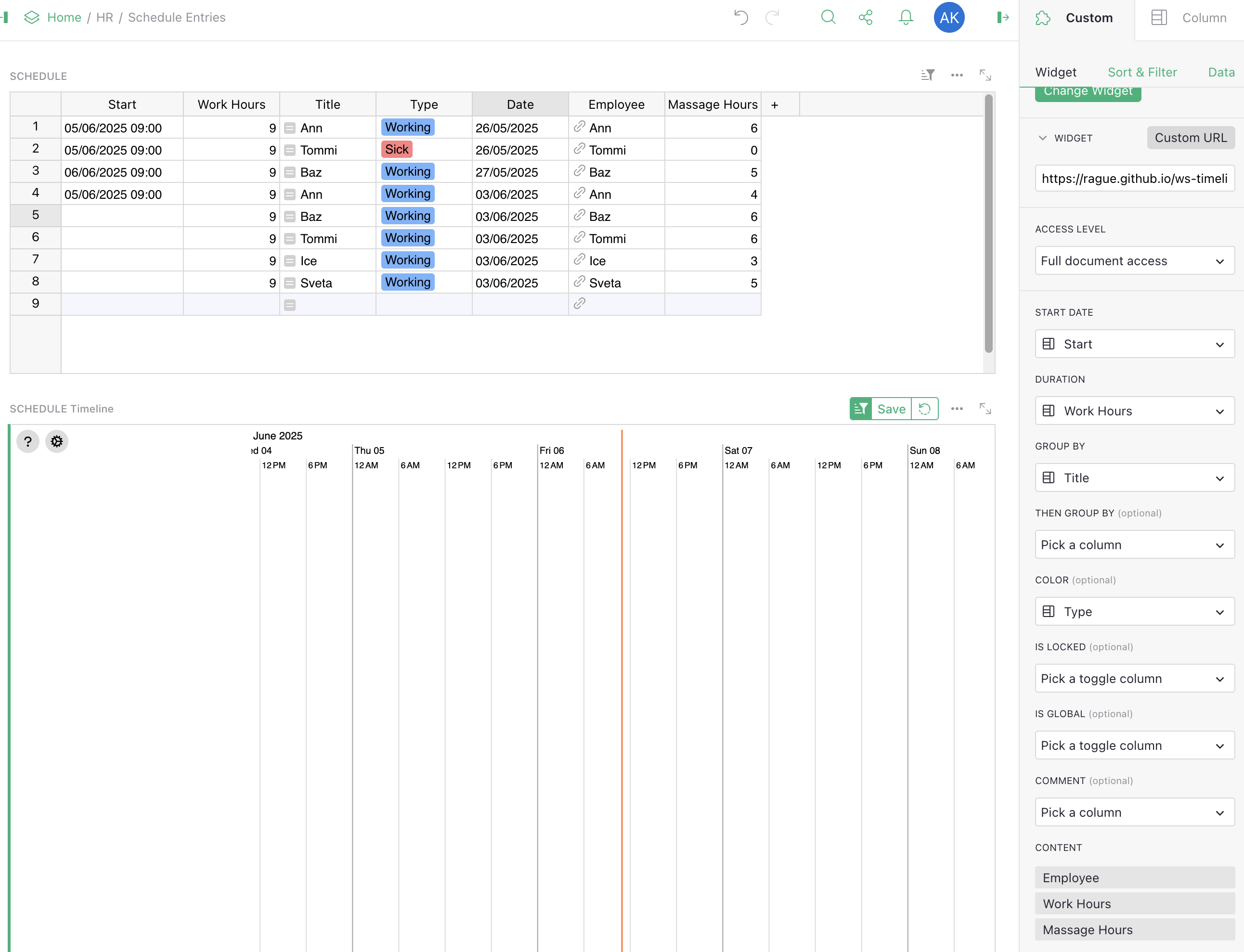
I have copied the document to have a look how it works, and then added the custom widget as you recommended in my document (linking to the custom URL), and gave the full access permission to the widget (in the future, I will use the widget from our website for safety).
I configured the widget to use the data table, and selected all the columns that it requires. (Please see the screenshot). However, it doesn’t display any data in the widget…
Do you have any idea why? Maybe I have to do something else? Specify which URLs are safe to load the widgets from? Any other ideas? I’ve selected all the required fields that the widget needs from the data table.
One other problem could be that the Title field is calculated (employee name)?
Okay I found the answer! As you can see, in my table some of the events have empty (not populated) Start (DateTime). This causes all the events to disappear / not show. If I populate the Start for all events in the table, then all of them display properly.
Just found another problem…
The widget doesn’t know about timezones…
The vertical red line (current time) shows time in UTC, but we are now in BST, so it’s one hour off…
This also causes the problem when editing Duration and/or EndDateTime (i.e. if you change Duration then End DateTime is set off by 1 hour, and vice versa).
I believe the author is from France or Quebec, so there must be some way to set the timezone for the widget…
Any advice would be appreciated!
EDIT:
Ok, I found that this is because Paris timezone is hard-coded in the code:
zone = TimeZone.europe__paris ()
It would be nice if it was possible to specify it in the widget options.